Howdy Folks!
I’ve been slowly making some backend changes to the site to drag it into modernity, but this weekend is probably the first time those changes are noticeable. What do you think of the new look?
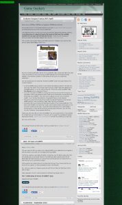
Here’s what it’s looked like for the past few years:
I had modded and hacked the previous theme to pieces over the last few years, so I thought since I’m tidying up the site anyway I should find a theme I like so I won’t have to change anything. Naturally, I spent like four hours this weekend tweaking the CSS and other files for the new theme. 🙂
Still, it mostly boiled down to some very minor changes to just two or three files, so if I ever update down the road it should be a lot less work than before. I believe all of the original functionality remains intact.
The important question is, is it a change for the better? There are still a few edges to be sanded (in particular, a lot of older posts don’t have an associated image, so they’re just a big white square on the list page), but overall I quite like it. I tried hard to keep the same clear and concise navigation — I don’t want to bloat the site for no reason, just give it a new coat of paint — but I’d appreciate hearing your thoughts on the new theme, especially if you notice anything that looks broken or just ugly.
With the new appearance mostly up and running, now it’s back to new content!
If you enjoyed this post and others like it, might you consider the Game Geekery Patreon?

I’ll be honest — I basically only ever read your blog through the RSS feed, and don’t actually quite remember what the old theme looked like. But speaking as an amateur web designer, the new one looks pretty sharp to me. I like the use of Caudex for a header font, and Muli isn’t a terrible body font if you like sans-serif. The contrast is easily readable without being harsh, and the green accents are subtle enough to work very well.
About the only change I would make is to move the Search box above the Patreon/RSS buttons (you currently have one light box directly adjacent to another light box, with nothing to break them up — swapping the buttons and the box would resolve that, though I do understand wanting to give a Patreon button as much prominence as possible). Something about the navigation bar bugs my aesthetic sense too, but I’m not quite sure what, or how to fix it — maybe its the fact that the separator/borders contact the top of the “body” container? Either way, it’s undefinable enough that it’s probably easily ignored.
Oh, okay, now that I can see a comment, there’s a second change I can suggest: kill that white border on the avatar image — perhaps make it a borderless light grey with green accent box like the various headers you already have?
Hiya, Celti — excellent suggestions! Thanks for the quick reply.
I was able to change the avatar box color, but gonna leave it as a solid box for now… the CSS is beginning to make my eyes cross.
This was the old look here. I still may try one of the themes in this family that has the same structure but keeps a “dark text on light background” palette, not sure yet.
Appreciate the pointers!
Hooray! Welcome to the light-on-dark brotherhood!
:: coin pouch jingling as I pat it ::
Ah, yes, thank you. I came here of my own volition. Yessiree, no bribery or impropriety whatsoever…
It’s disturbing to see that you’ve defected from the dark-on-light side to the light-on-dark side. My master always told me to beware those powers…
More seriously: looking good, Mook!
(now you just have to post those pictures of yourself as Mena Suvari, and you’ll officially be the most attractive GURPS blogger of the bunch)
Or be banned from the internet 🙂
I’m still not 100% sold on the color, as I really do prefer dark-on-light… but I can’t decide if there’s a legit reason for it, or if I’m just holding on to outdated advice (see also: having a huge CRT monitor for *years* instead of junking it for an “inferior” LCD screen).
I know at one time that was solid design advice, but I feel like this color combination works, it seems legible because the gray is so light.
We’ll see how it goes! Thanks for mentioning.
I like it! Also, can you send me those pix of you as Mena Suvari?
It’s better and less cluttered.